Creating documentation articles
Images and screenshots
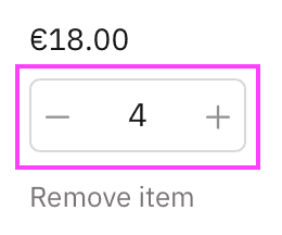
Screenshot annotations
✅ Use correct color for annotations
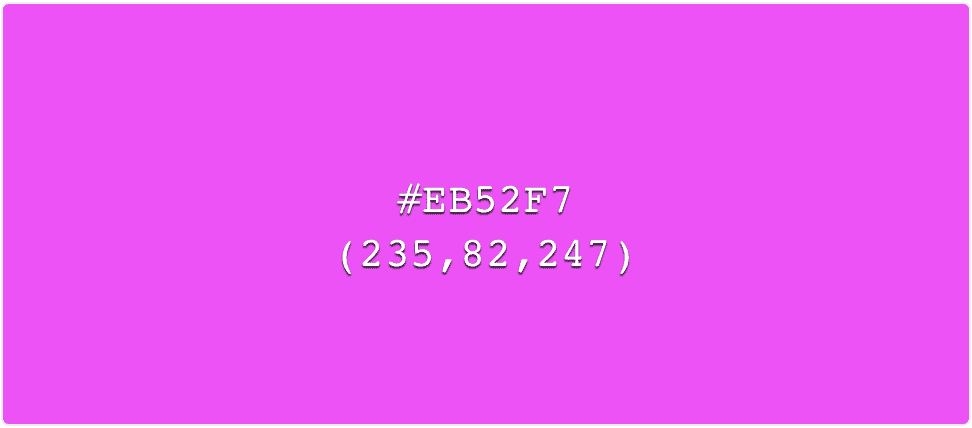
#EB52F7 or rgb(235, 82, 247).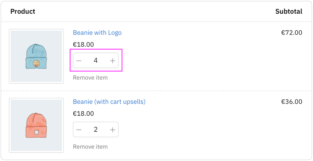
- Use the correct color for screenshot annotations. Annotations in a consistent color across the entire documentation are easier to identify.
❌ Don’t do this
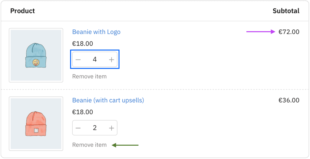
- Don’t use different colors (hue), shades or tints of the annotation color:
- Is the blue rectangle an annotation, or part of the element?
- What is the difference between an arrow in magenta and another in green?
✅ Use correct shapes to highlight areas of the image
- Highlight specific areas of the image using a rectangle or square with borders in the correct color (see above) and with square borders — no rounding borders.
- Highlight specific elements
❌ Don’t do this
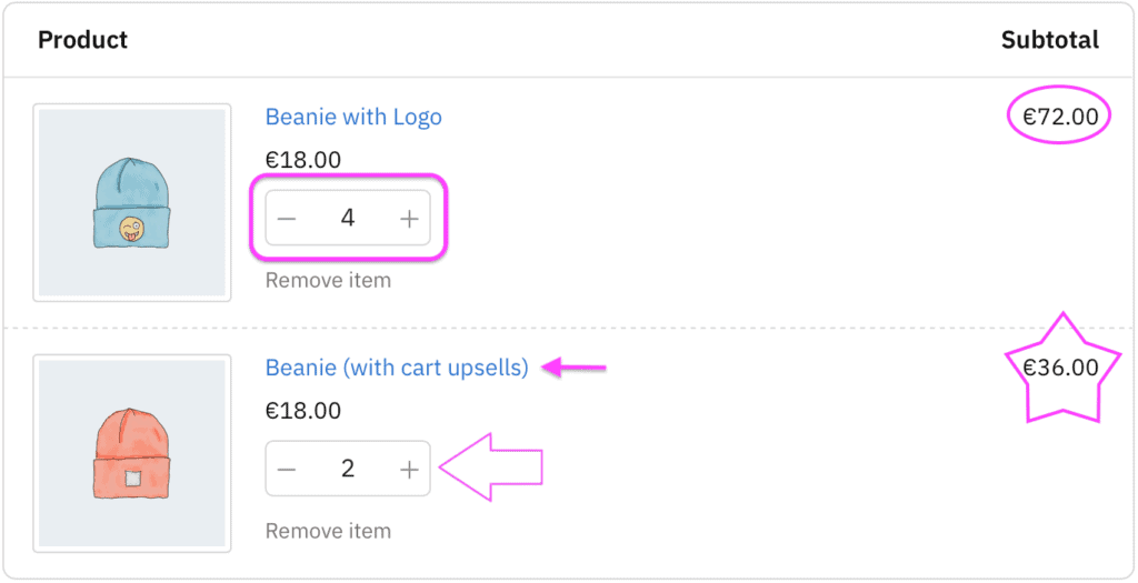
- Don’t use other shapes such as rounded rectangles, circles, ellipsis, stars or hollow arrows.
- Don’t use shadows on screenshot annotations.
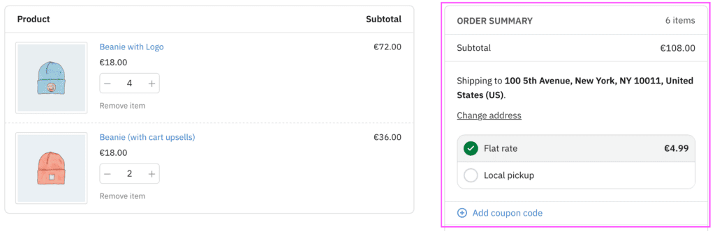
Image context
✅ Show enough context for the element
- When taking screenshots, show the specific elements and some surrounding elements to give more context.
❌ Don’t do this
- Don’t use images that do not have enough context, leaving too many questions unanswered:
- What page is this element being displayed on?
- Which product is it about?
- Don’t show parts that are irrelevant to the context of the element, or if it is not related to the documentation.